I belong to a number of writers’ groups on Facebook. Participants often post paragraphs from their works in progress (WIPs), ideas for stories, questions about writing and publishing, and opinions on AI. The discussions are lively, sometimes helpful, and sometimes contentious (especially the ones about AI).
The ones that I find most interesting are the ones in which group members post the proposed covers of their books and ask for feedback. Sometimes they post multiple versions of covers and ask which works best.
I have plenty of opinions on covers and the graphic elements that make them up. I’ve worked at publishing houses that produced magazines, textbooks, children’s stories, religious workbooks, and more. During those two decades, I met with many designers and other editors and learned from them, and had input on magazine covers and illustrations for stories. One of the cover ideas that I had and the designer implemented with improvements won an award.
So when group members have questions about their proposed covers, I have lots of opinions. Here’s some of what I know, or prefer, about cover art. Take these suggestions or leave them. They’re not laws or even rules.
The most common comment is deriding “AI slop,” a charge that is laid about most covers. Sometimes, the person who posted the cover explains that they hired a professional artist or designer to create it. Nevertheless, almost any cover posted leads to a discussion about the merits, or lack thereof, of using AI for cover design.
I usually don’t get involved in those discussions. They are never resolved. Like political opinions, judgments about AI use seldom sway anyone to change their way of thinking. They’re largely exercises in announcing your opinion to the world.
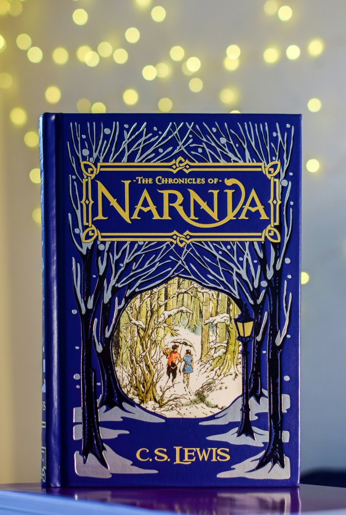
What I do find interesting are the details of the covers—the illustrations, fonts, titles, and colors.
Memoirs are perhaps the hardest books to choose cover illustrations for if you yourself don’t want to be pictured on them. You too often get generic illustrations. What might work instead? You can use a subhead that makes it clearer—”Broken Pieces: Growing up With a Schizophrenic Mother,” for example. The best advice I can give is to look at popular memoirs or covers that grab you and see what they have in common.
Many proposed covers are too cluttered. They have the title and the author’s name, a muddled illustration that has too many elements—tries to do everything—evoke the genre, have a skyline of a city, maybe a car from a certain era, and/or both the protagonist and the antagonist. Because there are so many elements, none of them stands out.
A major aspect to consider is how the book cover will look in a thumbnail on the page of a catalog, list, or website. It should at least be readable. The title, author, and one graphic element may do the job.
One of my pet peeves is the colors and fonts authors or designers choose. Again, they should be readable. A subtitle that has to appear in little, tiny type gets lost. White (reversed out) type on a light-colored background (light blue or pale yellow) is difficult to read, especially for readers whose eyes aren’t 20/20. Just because you’ve written a noir mystery or a vampire novel doesn’t mean that most of the cover needs to be black with dark purple accents. Choose colors with contrast. You can pick up a color from another part of the cover illustration to use for the title. Go through a page of fonts until something catches your eye. It will probably catch the potential reader’s eye, too.
Finally, imagine how your book will look displayed on a shelf in a bookstore or on a webpage with multiple books. Will a potential reader stop and look or glance right past it? One gets you sales; the other doesn’t.
Discover more from But I Digress . . .
Subscribe to get the latest posts sent to your email.

Thanks for this helpful article; I printed, highlighted it, and will consider your suggestions when choosing the cover for the novel I’m revising. Lee
LikeLike